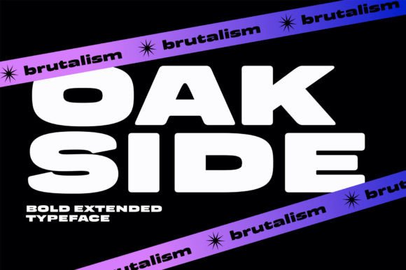
Oakside: A Bold Extended Typeface for Modern Web Design
When a landing page needs instant impact or a hero section demands a visual anchor, display typefaces step into the spotlight. Oakside answers that call with a confident extended silhouette, clean geometry, and a voice that feels both modern and refined. As a web designer, I look for fonts that do more than look good—they need to hold visual weight, shape hierarchy, and communicate brand tone before a single sentence is read. Oakside sits right at that intersection of aesthetic presence and digital usability.
What Makes Oakside Stand Out as a Display Font
Oakside is a bold extended typeface built for high-impact digital environments. Its letters stretch wide and upright, with crisp terminals and a consistent stroke rhythm that feels structured without being rigid. The personality leans modern and elegant, with a slight editorial edge. There is no excess ornamentation, just proportion and precision. In UI terms, this means it renders cleanly across screen resolutions, from retina displays to standard monitors, without losing its crispness. Its extended proportions naturally draw the eye, making it a smart choice for any web layout that needs to signal confidence and polish.
At large sizes, the font reveals subtle details—uniform widths, balanced counters, and a vertical stress that creates a steady baseline. These characteristics do not distract; they reinforce readability in short bursts. Oakside thrives as a statement maker. It is not designed for long-form reading, but it dominates short phrases, taglines, and brand names with an authority that many other display typefaces attempt but rarely achieve without overwhelming the surrounding design.
Placing Oakside in Web Layouts for Maximum Effect
Every web project has moments where the typography must stop a visitor and focus attention. Those moments are where Oakside belongs. I use it primarily for hero titles, large section headings, call-to-action banners, and navigation elements that require extra presence. For example, a coaching website might set the value proposition in Oakside over a calm lifestyle image, creating an immediate emotional pull. A product landing page could anchor its primary headline in the typeface, pairing it with generous whitespace so the message lands without competition.
Online store banners benefit from its extended width because it fills horizontal space naturally, reducing the need for additional graphic elements. Blog graphics and digital ads that rely on a single bold word or phrase find Oakside especially useful—it turns a short headline into a visual asset. In portfolio sites, the font helps designers and photographers present their name or discipline with a signature look that feels bespoke. For course sales pages and digital product covers, Oakside introduces a premium texture that supports conversion-focused layouts without feeling pushy.
Buttons and short CTAs are another practical application. Because the letterforms stay legible even at reduced sizes compared to many extended fonts, Oakside can live in oversized pill buttons or stretched ghost buttons on dark backgrounds. The key is to limit its use to moments where brevity meets high contrast. Overusing it in dense paragraphs would erode the user experience, but applied with restraint, it sharpens the entire visual hierarchy.
Building Readable, Responsive Designs Around Oakside
Display fonts often struggle on smaller screens, but Oakside holds up well when sized appropriately. On mobile devices, I increase the tracking slightly and lift the font size for hero titles to maintain legibility without crowding. A responsive rule of thumb: set Oakside headlines at 2.5rem or above on mobile, expanding to 4rem or beyond on desktop. Because of its extended proportions, line height should stay tight—1.0 to 1.1 for single-line headers—so vertical rhythm remains controlled.
Dark backgrounds and image overlays are where Oakside truly shines. The bold weight and wide stance create high contrast against deep backdrops, ensuring readability on overlay banners or full-screen hero images. On light surfaces, a slightly heavier weight or a subtle text-shadow can preserve its punch without adding visual noise. For small buttons or interface labels below 16px, I usually turn to the sans-serif companion; Oakside is not built for micro-copy, but it can accent a large conversion button exceptionally well when the rest of the interface stays minimal.
Pairing Oakside with Supporting Typefaces
A confident display font like Oakside needs a balanced partner. I gravitate toward neutral sans serif fonts for body copy, using pairings that emphasize clarity without competition. A geometric sans with open apertures creates a seamless digital feel; a humanist sans adds warmth for lifestyle brands. For editorial-style projects—think blog headers, journal sites, or design agency portfolios—a crisp serif font in the subheadings can elevate the entire composition, giving the page a high-end magazine rhythm. The goal is always the same: let Oakside command the voice while the supporting type keeps reading effortless and scannable.
Testing font weight distribution is part of the workflow. If Oakside appears in bold or black for primary headers, the body font should stay in regular or light weights to avoid typographic competition. Similarly, line spacing around Oakside headlines needs extra breathing room; generous padding on the section below prevents the eye from feeling trapped. This pairing practice supports scanning behavior and reduces cognitive load, which directly impacts engagement and time on page.
How Oakside Shapes Brand Perception and Trust
Typography quietly shapes trust. A typeface that feels inconsistent or overly decorative can undermine a brand’s authority. Oakside communicates stability and a modern sensibility. Its extended structure suggests spaciousness and calm confidence—qualities that translate into brand attributes like reliability, creativity, and professionalism. For SaaS founders, marketing consultants, and e-commerce brands, the typeface supports a narrative of clarity and forward-thinking design. When visitors encounter such a deliberate font choice on a landing page, it signals attention to detail and a considered digital presence. That impression influences bounce rates, conversion, and brand recall.
Furthermore, Oakside maintains its distinctive voice across touchpoints. Whether used in email headers, social media graphics, web banners, or digital brand kits, the visual identity stays anchored. Consistent typographic language builds recognition faster than color palettes or icon sets alone. It is an asset that quietly ties together disparate design elements into a unified story.
Practical Considerations for Web Designers and Developers
Before implementing Oakside in a live project, a few technical details matter. Check the included font files and verify webfont formats such as WOFF and WOFF2. These are essential for cross-browser compatibility and fast loading. Inspect the available weights and any alternate glyphs or extended language support that might be useful if the project targets multilingual audiences. For European brands or agencies serving diverse regions, the presence of Latin-extended characters is a practical necessity.
Licensing is another critical step. Oakside, like many premium display typefaces, is offered as a commercial font. When using it for client websites, digital products, online stores, or e-commerce platforms, ensure the license covers web embedding, page views, and the intended use. Some licenses restrict use in logo design or template redistribution, so reviewing the terms keeps a project legally safe. For landing page templates and design assets sold to others, the license must explicitly permit derivative distribution. Clarifying this upfront prevents headaches later and respects the creator’s work.
Bringing Oakside into Real Digital Projects
When I integrate Oakside into a creative portfolio, the typeface becomes a headline anchor that can rotate across case studies and project names without losing consistency. A boutique online store selling artisan goods might set its brand name in Oakside across the site header, using the extended width to create a memorable marquee effect. Coaching and consulting websites can pair it with calm lifestyle photography, relying on the font’s bold posture to convey authority without aggression. For a course sales page, Oakside leads the value proposition at the top of the page, while clean sans-serif body text guides the reader through the curriculum details.
The font also adapts well to digital brand kits. When designers provide logo treatments, stationery mockups, and social media templates, Oakside can live in the primary wordmark or a stylized monogram, then reappear in highlight text across Instagram stories or Facebook ad headlines. This consistency amplifies the brand voice and reduces the design debt of hunting for multiple typefaces. It is not a font for everywhere, but it is a font for the right place every time.
Readability Advice for Complex Backgrounds and Small Screens
- Image overlays: When placing Oakside headlines on top of photos, use a subtle dark overlay or a semi-opaque shape behind the text. This preserves legibility without muting the image.
- Mobile hero sections: Scale the font down proportionally, but keep letter-spacing open enough to prevent letters from merging on smaller viewports.
- Dark mode: Oakside’s bold weight remains crisp against dark backgrounds, but for body contrast, ensure the supporting font has sufficient gray-level variation.
- Small buttons: Reserve Oakside for primary action buttons that are at least 48px in touch target size; for smaller UI elements, fall back to the paired sans-serif.
- Light backgrounds: Use the heaviest available weight to maintain visibility, and consider a very subtle text-shadow if the surface shares similar brightness.
Why Oakside Supports Conversion-Focused Digital Design
Conversion design relies on clarity, guidance, and emotional resonance. Oakside injects visual excitement into the moments that matter most—headlines, calls-to-action, and value propositions—without compromising readability. Its extended, clean architecture gives the eye a natural anchor, helping visitors locate key messages quickly. In split-testing scenarios, I consistently find that a distinct display typeface for primary headlines reduces visual monotony and increases scroll depth. Oakside, thanks to its balanced proportions and polished finish, achieves this without feeling trendy or disposable. It supports a long-term, scalable design system rather than a one-off gimmick.
By carefully controlling where and how Oakside appears, I maintain a consistent brand tone while letting the font contribute to the user journey. It marks the start of a visual story, not the entire narrative. That restraint makes it versatile across landing pages, microsites, digital apps, and even presentation decks that follow the same brand system. As a web designer, having a reliable, elegant, and technically solid display typeface in my toolkit means I spend less time tinkering and more time crafting experiences. Oakside fills that role with quiet assurance.